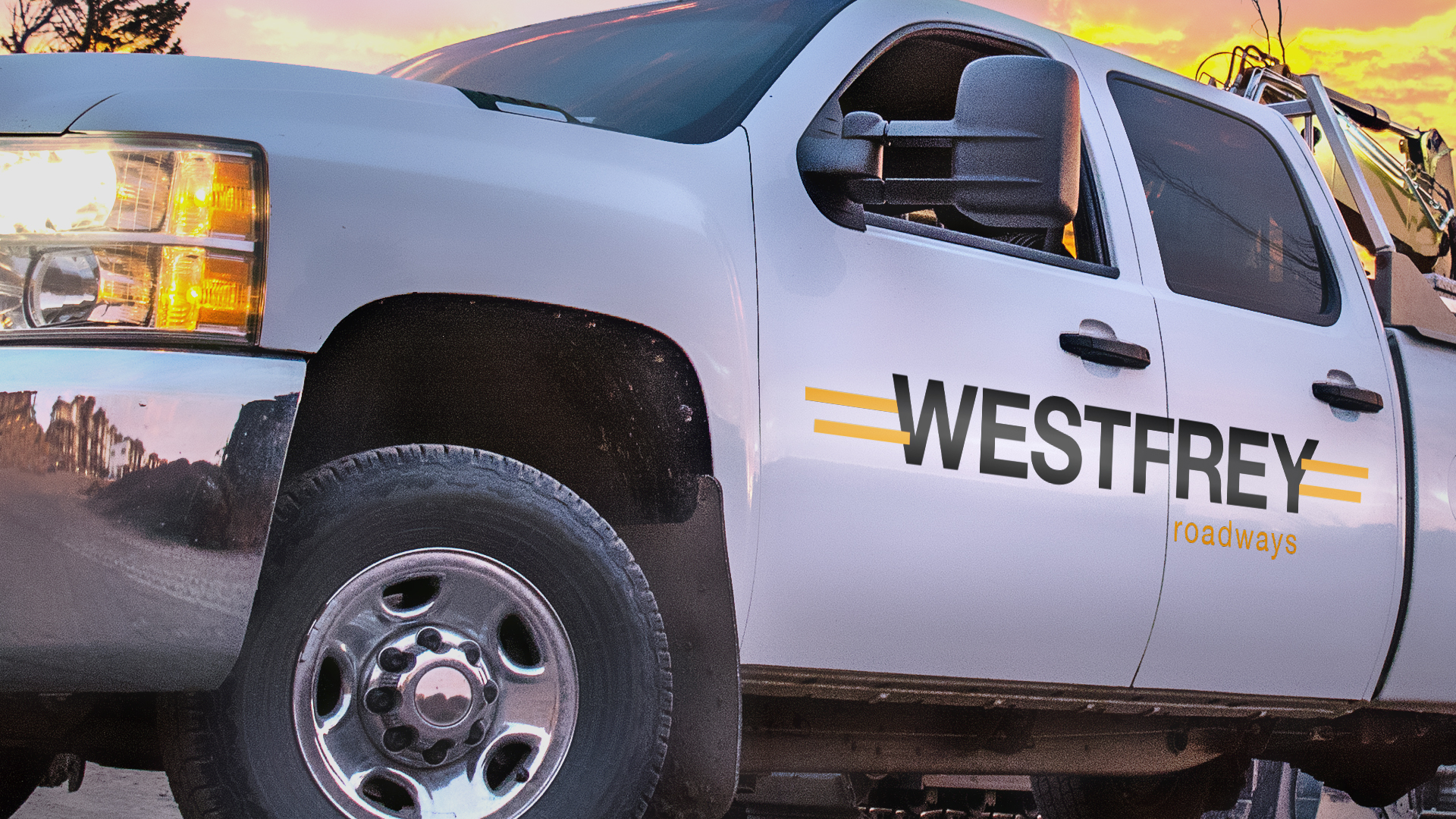
WestFrey Roadways
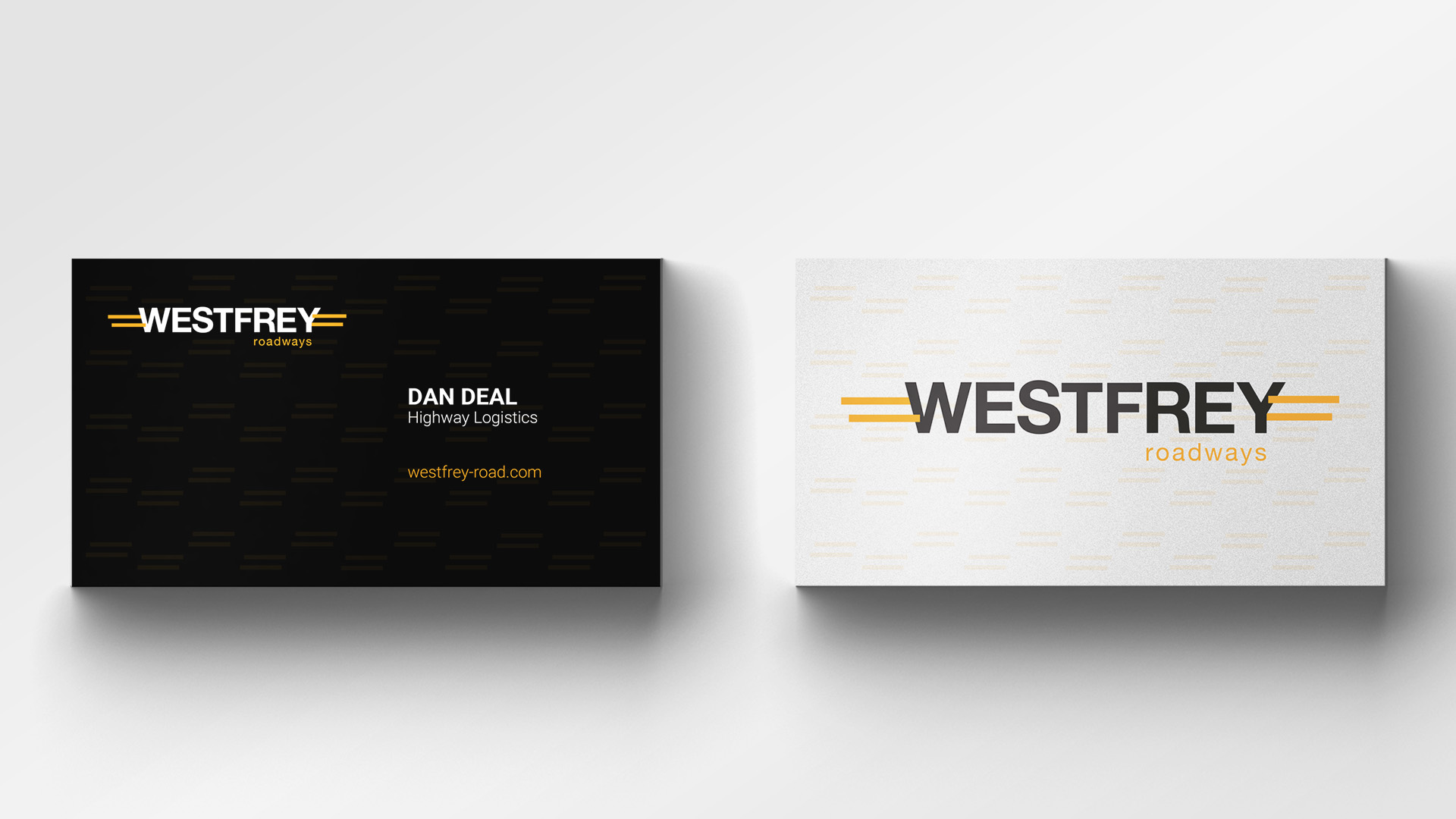
WFR specializes in resurfacing and constructing new roadways. They mainly work under local municipalities, so the need to attract outside clientele is minimal but it was clear after an initial meeting they did want to present themselves as an industry leader by having a refined identity.
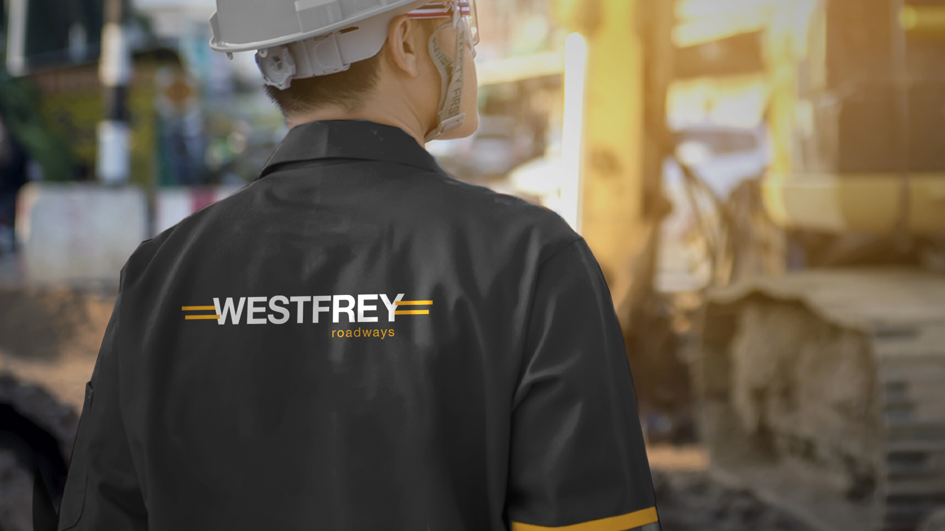
It was decided early on that a road would somehow be incorporated into the final design, this ultimately led to the yellow lines anchoring the ends of the bold sans-serif typeface, symbolizing the lines centering a roadway. These lines also work as a great design element used separately across different mediums.
Let's Talk →
I would love to hear about your project.
